| Info | ||
|---|---|---|
| ||
|
The 'FAQ' Element is similar to the Accordion in that it allows you to add text, and it will provide drop-downs.
Step-by-step guide
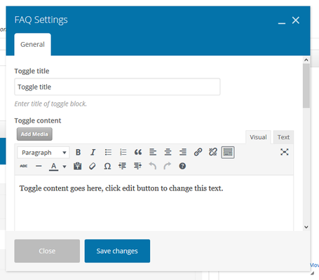
- Toggle Title:The title of your toggle content. (i.e Advertising rates)
- Toggle Content: Add media, by using the 'Add Media' button. Select from your computer or the media library. Add text, similar to the 'text block' widget. You may use visual or text options.
- Style: Select a Toggle design style. Choose from: Default, Simple, Round, Round Outline, Rounded, Rounded Outline, Square, Square Outline, Arrow, Text Only
- Icon Color: Select color schema using the drop-down
- Size: Select a Toggle display size. Choose from: Small, Normal, Large
- Default State: Select "Open" if you want toggle to be open by default. Choose from: Open, Closed.
- Element ID: Enter element ID (Note: make sure it is unique and valid according to w3c specification).
- Extra Class Name: If you wish to style particular content element differently, then use this field to add a class name and then refer to it in your css file.
Related articles
| Filter by label (Content by label) | ||
|---|---|---|
|
...