| Info | ||
|---|---|---|
| ||
|
...
| Note | ||
|---|---|---|
| ||
|
...
|
| Tip | ||
|---|---|---|
| ||
|
Step-by-step guide
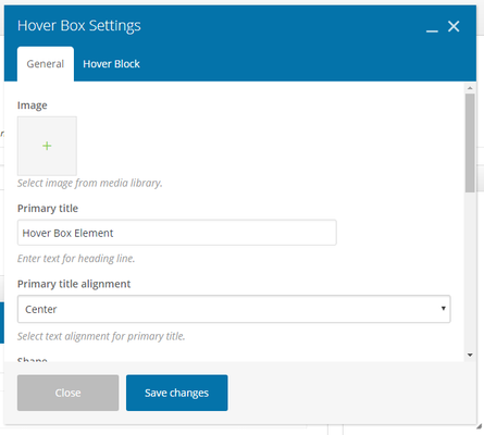
- Image: Select an image from the media library
- Primary Title: Enter text for the heading line
- Primary Title Alignment: Choose an alignment for the title. Choose from: Left, Right, Center, Justify
- Shape: Select a hover box shape. Choose from: Square, Rounded, Round
- Width: Select block width (percentage). Choose from 10%-100%.
- Alignment: Choose an alignment for the hover block. Choose from: Left, Right, Center
- Reverse Blocks: If selecting yes, this will reverse hover and primary block.
- Element ID: Enter element ID (Note: make sure it is unique and valid according to w3c specification).
- Extra Class Name: If you wish to style particular content element differently, then use this field to add a class name and then refer to it in your css file.
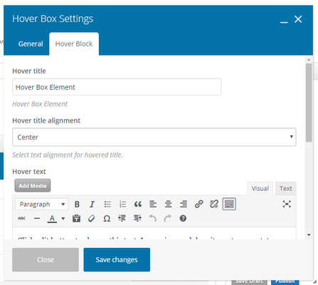
Hover Block Settings:
- Hover Title:
- Hover Title Alignment: Select text alignment for hovered title.
- Hover Text: Enter the text you want displayed when hovered over
- Background Color: Select color schema using the drop-down
- Add Button: Add button for call to action. If selecting yes,fill in the hover button settings tab
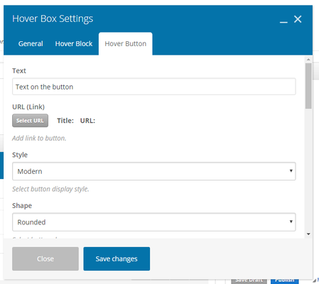
Hover Button Settings:
- Text: Enter the text for your button
- URL: Add a link to the button
- Style: Select a button display style. Choose from: Modern, Classic, Flat, Outline, 3D, Custom, Outline Custom, Gradient, Gradient, Custom
- Shape: Select button shape. Choose from: Square, Rounded, Round
- Color: Select color schema using the drop-down
- Size: Select button display size. Choose from: Mini, Small, Normal, Large
- Alignment: Select button alignment. Choose from: Inline, Left, Right, Center
- Add Icon: If choosing yes, fill in the following icon options:
- Icon Alignment: Select the icon alignment. Choose from: Left, Right
- Icon Library: Select a type of icon set (similar to a style of emoji)
- Icon: The options for the icon will change depending on what set you picked above
- Element ID: Enter element ID (Note: make sure it is unique and valid according to w3c specification).
- Extra Class Name: If you wish to style particular content element differently, then use this field to add a class name and then refer to it in your css file.
- Advanced On Click Yes: Check yes to Insert inline onclick javascript action.
Related articles
| Filter by label (Content by label) | ||||||||||||||||||
|---|---|---|---|---|---|---|---|---|---|---|---|---|---|---|---|---|---|---|
|
...