- All users who have access to one/all of the following: pages, blogs, contests, and sidebars
- This is applicable to: All themes
|
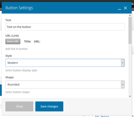
These are the instructions for filling out the 'Button' element.
Step-by-step guide:
- Text: The text that will display on your button
- Style: Select a button design style. Choose from: Modern, Classic, Flat, Outline, 3D, Custom, Outline Custom, Gradient, Gradient Custom.
- Shape: Select a message box shape. Choose from: Square, Rounded, Round
- Color: Select color schema using the drop-down
- Size: Select a button display size. Choose from: Mini, Small, Normal, Large
- Alignment: Select button alignment. Choose from: Inline, Left, Right, Center
- Add Icon: Choose yes, if you'd like to add an icon
- Icon Alignment: Select an icon alignment. Choose from: Left or Right
- Icon Library: Select a type of icon set (similar to a style of emoji)
- Icon: The options for the icon will change depending on what set you picked above
- Element ID: Enter element ID (Note: make sure it is unique and valid according to w3c specification).
- Extra Class Name: If you wish to style particular content element differently, then use this field to add a class name and then refer to it in your css file.
- Advanced On Click Action: Select yes if you want to Insert inline onclick javascript action.

Related articles
Related articles appear here based on the labels you select. Click to edit the macro and add or change labels.


