Button Element
This Article Is For:
- All users who have access to one/all of the following: pages, blogs, contests, and sidebars
- This is applicable to: All themes
These are the instructions for filling out the 'Button' element.
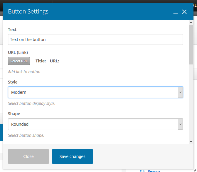
Step-by-step guide:
- Text: The text that will display on your button
- Style: Select a button design style. Choose from: Modern, Classic, Flat, Outline, 3D, Custom, Outline Custom, Gradient, Gradient Custom.
- Shape: Select a message box shape. Choose from: Square, Rounded, Round
- Color: Select color schema using the drop-down
- Size: Select a button display size. Choose from: Mini, Small, Normal, Large
- Alignment: Select button alignment. Choose from: Inline, Left, Right, Center
- Add Icon: Choose yes, if you'd like to add an icon
- Icon Alignment: Select an icon alignment. Choose from: Left or Right
- Icon Library: Select a type of icon set (similar to a style of emoji)
- Icon: The options for the icon will change depending on what set you picked above
- Element ID: Enter element ID (Note: make sure it is unique and valid according to w3c specification).
- Extra Class Name: If you wish to style particular content element differently, then use this field to add a class name and then refer to it in your css file.
- Advanced On Click Action: Select yes if you want to Insert inline onclick javascript action.
Related articles