| Info | ||
|---|---|---|
| ||
|
...
| Info | ||
|---|---|---|
| ||
Starting November 13 2018:
|
To add a blog category to a page, use the Blog/News element and fill in the details listed below:
- Widget Name: This is the name of the widget showing in the Drag-And-Drop Editor. It will not be displayed on the website.
- Display Title: Choose whether you’d like to have the title displayed by clicking “Yes” or “No” from the dropdown menu
- Blog/News Category: Select the blog category you wish to add to the page. (press the "Ctrl" button to select multiple categories)
- Sort Order: Choose the order you'd like the blogs to display in. We recommend selecting only one category if "rank" is selected as the sort order.
- Published Date: Will display posts by the most recently published posts (by published date)
- Modified Date: Will display posts based on when they were last modified.
- Rank: Will display posts based on the rank order you have set for the category selected. (Note: Ordering may not appear as intended when listing posts from multiple categories)
- Top Stories: Top Stories are stories getting the most viewswithin the past week. (Example: Monday to Monday).
- List Offset: Skip the first few articles using this offset. Ideal for pages with multiple blog/news lists using the same category.
- Page Summary Length: Select a length for the article summary. Default is 320 characters. Use 0 (zero) to hide summary. Leave blank for unlimited character length.
- Display Author Name: Using the drop-down choose whether you wish to display the author's name
- Display Date: Using the drop-down choose whether you want to display the date the blog was published.
- Layout: Choose a layout for your blog display. (see layout options below)
- List Ad Position: e.g. 3, none, top, bottom. Number of blog articles that will appear above the ad for single column layouts. Multi-column layouts will display the ad at the bottom of the list. Set as 'none' to disable blog list ads. Set as 'default' to use site defaults.
- Minimum Column Width: In pixels. Use 0 (zero) for 1 column display. Minimum width determines the number of columns that can appear in the available content area or mobile screen width. e.g. If set to 300, the content displays in 2 columns in a 700px area and in 1 column on a 320px wide mobile screen.
- Items To Display Per Page: Choose how many blogs (or items) you'd like to display on the page
- Allow Multiple Pages: Using the drop-down choose whether you want to allow multiple pages (infinity scroll) for the blog category
- Extra Class Name: If you wish to style particular content element differently, then use this field to add a class name and then refer to it in your css.
...
- Horizontal Small Display: Displays a medium sized photo to the left, with headline, text and publish date. Best suited for detailed, variable content. (Image is uncropped)
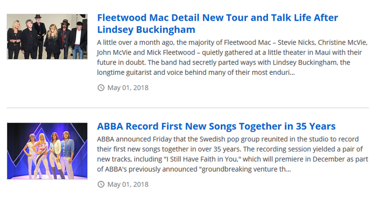
- Horizontal Display: Displays a large photo to the left, with headline, text and publish date. (image is uncropped)
...
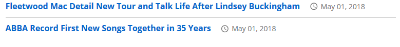
- Compact Display: Displays blog title and publish date. Best suited for minimal, fixed content.
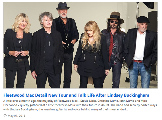
- Vertical Display: Displays a large photo on top of headline, text and publish date. Best suited for detailed, variable content. (image is uncropped)
- Rotator: Displays a large photo on top of headline and rotates through images. Similar to the feature rotator. (The image scales to fit inside the image area in the 'Rotator' layout. Image is contained)
...
- Image Overlay: Displays a large image with headline and publish date over top of the image. Best suited for visual, fixed content. (uses 16:9 crop in blog tool)
...
- Compact Image Overlay: Displays a skinny image with headline and publish date over top of the image. Best suited for visual, fixed content. (uses 16:9 crop in blog tool)
...
- Card: Displays a large image with headline and publish date below, in an outlined box (card). Best suited for detailed, variable content. (uses 16:9 crop in blog tool)
...
- Compact Card: Displays a medium image to the left of the headline and publish date, in an outlined box (card). Best suited for minimal, fixed content. (uses 16:9 crop in blog tool)
...